Logo Design
Helping you to envision your essence graphically is a challenge—strategically, tonally, even emotionally. But it’s also extremely satisfying when we strike gold. Here are a few favorites:
Feminine Strength
Coach Kira Hower wanted her logo to speak with beauty, elegance, and power to her practice’s theme of bringing “passion, purpose, and play” into women’s lives. The peacock feather embodies playfulness and sensuality, paired with typography that is balanced and flowing (that “K”!) in a classic blue and gold palette.
Transformative change
Brand identity goals for this new social sector nonprofit were to embody the dynamic, flowing nature of social transformation, using logo type to communicate both groundedness and spaciousness.
Owl be here
This logo integrates the themes of love, wisdom and positivity core to Tina’s work as a Parent Coach, communicating playfulness and approachability.
Natural renewal
The previous logo of this 60 year-old day camp featured appropriated Native American imagery that no longer served. The new design maintains much beloved signature font and colors, visually highlighting the camp’s woodsy setting and deep reverence for nature.
Movement therapy
Therapeutic movement teacher Susanne Liebich wanted her logo to show the inner sense of freedom her students gain from grounding themselves in a healing movement practice. The logo image flies over the stacked typography.
Harmony at a higher bandwidth
The lips motif had been around for awhile, but the graphic was dated. So BroadBand's logo got a facelift: a fuller, expressive mouth, a bold, brassy font, poppy-er palette, and the addition of a musical note to tie it all together.
Fly like a dragonfly
MCS’ partners knew they wanted a dragonfly for their logo because it represents agility and adaptability--critical attributes of successful mediations. We kissed a lot of frogs (pond humor!) before settling on this treatment. The seraph font adds traditional elegance and conveys a light touch.
Forward movement
The founder of this new professional services venture wanted a no-fuss contemporary logotype treatment. Communication goals were: progress, efficiency, professionalism, and energy, with a graphic element that is universally understood.
Spiraling up
This LLC partnered with education-sector clients to develop continuous improvement in programs and practice. Our logo strategy sought to communicate positive evolution, collaboration and fresh perspective, using a bright palette and contemporary fonts.
Party animals
"Spirit & Company" event designs give families or corporate clients a personal, playful way to mark milestone celebrations. These customized pairings of pen and ink illustrations with pops of color look great on invitations, cocktail napkins, t-shirts, and all your party swag.
The sky’s the limit
Independent school Concord Adademy wanted a fundraising event logo to celebrate their boundless commitment to love of learning. The image incorporates multiple elements—the event’s tagline and décor theme of clouds and sky, the school’s corporate branding colors—to communicate academic rigor and creative ingenuity.
Dancing through life
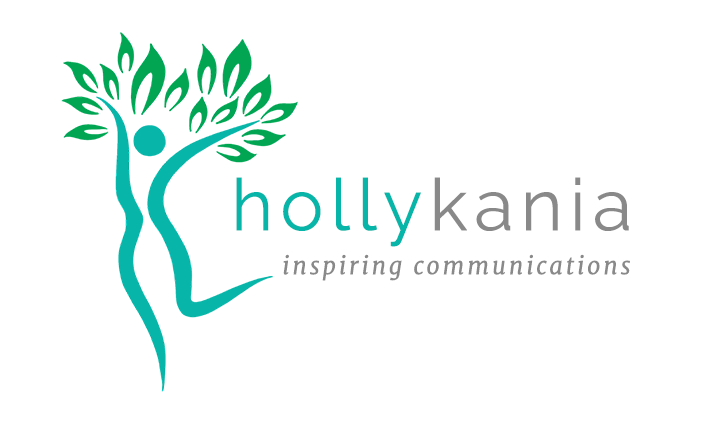
For my own logo, I wanted to capture my joy in living life as a creative being. I'm a writer, dancer, singer, designer AND a big fan of trees. My daughter Lucy drew this beautiful digital graphic of a dancing woman, shaped like the letter K, leafing into life.


